Friday, December 25, 2009

Club Provocateur


Just finishing off project producing graphics for the opening of New
York Citys hottest new club. Working closely with the design and builders, Color X printed large format graphics that bring elegance and hipness to this exciting new club. Printingt dye sublimation large scale on fabrics brings intense color saturation and quality that really brings the art to life. The image is continued by dye sublimation printing on a different , and more durable fabric which is upholstered into the banquet seating. This dramatic imaging creates a really amazing space. Stay tuned for more graphic applications in this project

Wednesday, November 11, 2009

Mansions and Millionaires Comes To a Close


Wow, I can't believe it's almost time to close the doors to this year's designer showcase. It was a great show, with all of the designers creating special spaces out of neglected rooms. There were so many visitors to the show and it was great having a chance to speak with so many design enthusiasts. I am thankful for all the positive support! I am already looking ahead to the next one.

Monday, October 26, 2009

MTD's Version on the Harper's Bazaar Cover


Here's an example of the Gray and Red color scheme transitioning to home. Here we used varying shades and textures of gray in fabrics and brought in a shade of red with pink undertones for a vibrant contrast.

Gray Gray Gray!!


Check out the cover of this month's Harpers Bazaar. Great color combo - shades of gray with a pop of red! Wouldn't that make a great color scheme for a living room? Or even a bedroom?? Grays paired with a vivid accent is hot right now in fashion and it's carrying over to the home front. Gray and yellow was popular last season. Look for gray with shades of red ranging from tomato hues to pinks.

Wednesday, September 23, 2009

Color Tips and Trends

Color has the power to change not only the look of your environment, but also how you FEEL IN that environment. Vibrant saturation can inspire and refresh, soothing tones can relax and renew. You can set the mood by your choice of color. – Marlaina Teich, Interior Designer
What colors are trendy this season and which ones can be used to decorate the home?
Yellow is trendy this season, paired with gray and touches of hot pink or black. TRY Benjamin Moore (BM) Sultan Yellow 2155-50 and BM Royal Fuchsia 2078-30. Gray is everywhere this year, serving as the backdrop for pops of color or as its own scheme, using differing shades and textures. TRY BM Shadow Gray 2125-40, BM Gray Shower 2125-30, and BM Sweet Innocence 2125-50.
What decorations have a lot of color and can be used to accessorize furniture?
Pillows and throw blankets are great ways to add a splash of color without making a huge investment. Adding plants to your scheme is another way to inexpensively and naturally add color and dimension to a space. Area rugs can also add another layer of color and texture to a space. Lamps with funky shades can bring in a dash of color as well.
What other kinds of eye-catching accessories are there?
TRY decorative porcelain vases. Layer three robins egg blue vases of varying heights on a sideboard or deep window ledge. You can also bring in color with metal finishes. Add Mercury candlesticks and you are adding gray to your scheme. Lean a gold, antiqued finish mirror against a wall and you are bringing in yellows.
What combination of colors would you recommend for a harmonious environment?
Any colors that occur in nature, when paired together will create a harmonious scheme. The rich green of the grass, the earthy brown tones of the tree bark, the yellow sunflowers. Or the blue of the ocean, the sandy pink beach, the gliding white and gray seagulls. Take your cues from nature and you cannot go wrong.
Tell me about of the importance of color in the home.
Color affects how we feel about a space. Some colors create a soothing, calm atmosphere, while others inspire energy and activity. A harried mom may need relaxing hues surrounding her to bring her back from the edge. A creative type may crave a riot of colors in his space to inspire him.
What colors are recommended for a clean look (quiet, peaceful)? Why?
Blues and greens are very restful. Blues in particular is known to lower our heart rates. They are perfect in bedrooms. TRY Sherwin Williams Meditative SW 6227, Sleepy Blue SW 6225 and Refuge SW 6228.
What colors are recommended for a bold look? Why?
Strong, saturated colors are great for a bold look. They inspire energy in a space. TRY Sherman Williams Enticing Red SW 6600, Gambrol Gold SW 6690, Tigereye SW 6362, and Umber SW 6146
What colors are recommended for a classic look? Why?
Warm neutrals are a classic scheme. People do not usually have strong preconceptions about the neutral beiges and earth tones that make up a classic scheme. They are not offensive and are perfect for living rooms where a lot of entertaining is usually held. Warm neutrals also inspire calm. TRY BM Barely Beige 1066, BM Indian River 985, and BM Olive Branch 2143-30.
What are a few recommendations for choosing the right color to decorate a room?
Think about how you plan to use the room. What activities will take place in that room? Is it a room that you want to have a clean, uncluttered feel? Go with the neutral. Is it a room where there will be a lot of conversation and entertaining? Vibrant color schemes encourage activity and liveliness. Is it a personal space? Choose your favorite color and go with it.
Can you give 15 tips to get a room with plenty of color?
Art work – choose fun, inspiring pieces with your desired colors
Area rugs or wall to wall carpeting
Drapery panels
Pillows – accent on the sofa or throw pillows for watching TV on the floor
Plants, Plants, Plants
Picture Frames
Lacquer trays for holding mail or paper work
A painted porcelain bowl for holding the car keys
Wicker baskets for holding magazines or extra shoes
Pretty placemats
Floral centerpiece
Bowl of fresh fruit
See -through jars of wrapped candy
Candles and candlesticks
Painted Walls

decorology: Stylish studios from Marlaina Teich

decorology: Stylish studios from Marlaina Teich

Thursday, September 17, 2009

JULIA CHILD'S KITCHEN


Julia Child's kitchen, on display at the Smithsonian National Museum of American History.


I love Julia's collection of copper pans hanging on all of the available wall space, and the fact that she hung paintings on the cabinet doors. The blue cabinet color is both retro and modern. And there is plenty of counter space—a MUST for any serious home cooking.

On remodeling the space...

• I would install task lighting and undercabinet lighting throughout the space.

• It looks like linoleum on the floors, which would be typical of the era. I would replace it with a rich, warm wood flooring. It would ground the soft blue of the cabinets.

• Also, I love the kitchen table, but it seems as though Julia used this as a workspace. It would be more functional as a counter-height freestanding table, which would keep the period feel of the space, but ease the strain on the back from bending while working at the table.

• The sink looks like a single-bowl model. I would replace it with a spacious double sink, which would aid in the cooking/clean up of such a busy workspace.

Friday, August 28, 2009

DORM DECOR

Newsday Article by Kristin Taveira
A newly minted cast of players is about to burst onto the world stage: The college-bound are ready to declare a break with their high school selves - they're ready to write their own scripts, choose their own soundtracks and realize their own creative visions.
For most young adults, the backdrop against which they'll play out these new and exciting scenes will be their living space - be it a dorm room, a first apartment or even a revamped version of the very room where they've spent their childhood. For many, taking a space and visually declaring it "my space" will be their first opportunity to make a statement that's uniquely their own. And with a little expert advice, they can learn to do it with polish.
Cookie-cutter catalog themes won't cut it with the big kids. "College-bound students are more interested in making rooms personal than thematic," says Eileen Kathryn Boyd, who owns a design firm in Huntington. But an emerging taste for the urbane doesn't mean you have to abandon youthful obsessions, says Merrick interior designer Marlaina Teich. It's just time to find a new way to express those passions - grown-up style.
Instead of wearing your heart on your sleeve - or all over your bedspread - scrap the cutesy overkill of themed bedroom decor and learn to say more with less, says Teich, who owns Marlaina Teich Designs.
Start with a modish color scheme: Cool, sophisticated gray, punctuated with a vivid color like orange or lime green, is the hot palette this season, Teich says. Also, there's a trend toward more earthy-feeling rooms, using more natural materials, she says. And in case you're fortunate enough to have some say over your furnishings, Teich says today's most fashionable fixtures feature sleek, clean lines with an industrial vibe, a la CB2 or IKEA.
Next, it's time to personalize it - cleverly. Add pops of color, comfort and individual flavor with judicious use of trimmings such as pillows, throws and desk accessories.
Finally, to give it the wow factor, Teich has two words for you: Accent wall. Use color if you can, and arrange a few key items into a high-impact display designed to put the exclamation point on your personal statement.
These cliché-busting ideas can give a sophomoric bedroom a college-style face-lift - no matter what label you wear.
To view the rest of the article: http://www.newsday.com/lifestyle/home-and-garden/college-freshmen-put-a-new-spin-on-dorm-decor-1.1396999

Monday, August 17, 2009

Monday, August 3, 2009

Artistic Tile and MTD

I am so excited to be collaborating with Artistic Tile for the Mansions and Millionaires Designer Showcase 09. Richard Johnson, PR Director at Artistic, my design team and I have been meeting to select the most GORGEOUS mosaics and stone finishes for the space.

According to Artistic Tile's website, " In 2004, Nancy Epstein opened a boutique showroom inside the Manhattan Center for Kitchen and Bath. In Fall, 2007 she opened a new, expanded flagship showroom in the equally esteemed Chelsea neighborhood of Manhattan. The new showroom design has since been rolled out in Manhasset on Long Island’s North Shore and Chicago on the prestigious LuxeHome floor of the Merchandise Mart. Artistic Tile’s showrooms invite designers and homeowners to play and interact with thousands of tile options in a lively atmosphere that includes an extensive design library complete with countless samples. Umbrella-shaped fabric canopies with handmade Murano crystal chandeliers bathe the space in warm light while illuminating lifestyle vignettes that beautifully blend a variety of products and suggested installations. Her devotion to creating a warm, comfortable, inspiring environment in each showroom is evident in every detail. Wine is served in the afternoons, coffee in the morning, and lunch upon request. "Our customer service and atmosphere should rival those of any luxury resort,'' Nancy notes, "but most important, our clients should love not only their finished projects, but also the experience of creating them."
Thank you to Nancy Epstein, Richard Johnson and the team at Artistic Tile for creating such an exciting and luxurious atmosphere.

Sunday, July 26, 2009

Rockrose's 200 Water Street


ROCKROSE just began leasing their 200 Water Street location and the response has been great! Just across from the South Street Seaport, this former NYU dorm is a hot rental. Fantastic views of the Brooklyn Bridge, convenient location and luxury amenities with an affordable price tag make this property THE place to be.

Thursday, July 23, 2009

Cathy Hobbs' "Metro Residential" TV Show


Last week I taped a segment for "Metro Residential" with host and Emmy award winner Cathy Hobbs. The show, which airs on Channel 11 PIX on Sundays at 9am, features segments on real estate and interior design. My spot is about outdoor entertaining and decorating. It will air mid August and I am already planning a Sunday brunch with friends and family to watch my maiden voyage into tv land! Of course, this brunch will be served poolside.

Monday, July 20, 2009

Metropolitan Institute of Interior Design

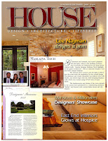
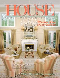
The July issue of HOUSE Magazine featured an in depth article on my alma mater - The Metropolitan Institute of Interior Design.


When the editor of House - Mr. Dennis Sheahan - called and asked me to contribute my thoughts of MIID, I was thrilled. Metropolitan is a quality institution with a top rate teaching staff and it was easy for me to give it my thumbs up.

Wednesday, July 15, 2009

AC Wilson Flowers


For gorgeous floral arrangements, AnnaMarie Wilson of ACW Flowers is the woman to call. For twenty years her arrangements have been beautifying Long Island residences, restaurants and corporate spaces.

Sunday, June 7, 2009

Great Project in Sea Cliff, NY


Just finished a great project for a wonderful family in Sea Cliff, NY. What a perfect experience - from the planning stages with the architect and contractor all the way through to final touches.


Developing a relationship with my clients is really what makes the project a success. Getting to know their lifestyle and their goals helps me put together a design plan that ultimately enables my clients to live with and love their new space.

Friday, May 22, 2009

Duralee Color Combo


Mmmmm, this is a fresh, fruity and delicious color combination shown by color pro Kate Smith at the Duralee showroom. Just in time for Summer.

Elle Decor Party For Ralph Pucci


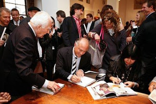
Monday night we attended the invitation only Ralph Pucci book signing. Between the people watching and the cool vibe, it was a fun night. Margaret Russell, editor of Elle Decor, was there looking stylishly sophisticated in a red Prada dress and killer Louboutin heels. Anna Sui, Jonathan Adler and Paul Matheiu were just a few of the design world stars who were there.


The event was held at the Pucci showroom on 18th street. The12th floor held incredible pieces of art - I mean furniture - by Vladimir Kagan. Amazing lines and textures. I fell in love with a gorgeous mid century chaise covered in a very up to date steel blue velvet. The night was definitely inspirational... design wise AND style wise.

Tuesday, May 12, 2009

Spring/Summer2009 Trends for Nurseries
Top colors for nurseries this year run from vibrant, saturated hues to soft, restful earth tones. Juicy Rasberry is hot this year, paired with yummy, rich chocolate brown shades. Benjamin Moore 2080-40 Wild Pink Benjamin Moore 2096-20 Chocolate Truffle.

Another great color combination that is hot for Spring/Summer is mixing earthy shades of Sage with accents of black and white. Try Benjamin Moore Saybrook Sage HC-114

When painting a baby’s nursery, just as much thought should go into selecting the type or brand of paint as to the color choice. Typical paint emits Volitile Organic Compounds (VOC’s) that are harmful to babies as well as full grown adults and our environment. There are more and more brands in the market right now that are offering low VOC paints. Benjamin Moore just came out with a brand new product for Spring 2009. It’s called NATURA and it is eco friendly with zero VOC’s , is practically odorless and dries within 30 minutes You can paint the baby’s room in the morning and have her sleeping in there by evening.

Hot accessories for Spring/Summer 2009 include state of the art baby monitors, tabletop organizers for baby’s binkies, bottles and toiletries and hip and trendy travel wipes cases.

Summer Infant Day and Night Color Flat Screen Monitor is perfect for keeping an eye on a sleeping baby. It’s a 7” LCD flat screen that can be wall or under counter mounted, or you can carry it with you to whichever room you are going to . $199
Bin-Go Tabletop Organizer has a divided main compartment with four side pockets for organizing all of baby’s tiny accessories – from hair clips to pacifiers to baby bottles. It’s made of canvas so it can easily be folded flat when not in use.
Cutie and Patootie has hip and trendy travel wipes cases available in graphic print designs in hot colors. They definitely add some excitement to a functional item.

Sunday, May 10, 2009

Green Design Tips


One of the big trends today is being green. The message out there is that each of us can do our part to save the planet for future generations. That’s a big weight on our shoulders, isn’t it? If you don’t recycle YOU WILL RUIN ANY CHANCE OF YOUR CHILDREN LIVING HAPPY LIVES! Well, actually it’s not really hard to do our parts. There are tons of little things that we can do to help the environment. Since this is an interior design post, I am going to give you some tips on decorating green.
One of the most basic changes that people make to their homes when decorating is choosing materials that are low in hazardous volatile organic compounds (VOC’s). When choosing your paint, opt for low VOC paint. VOC’s give off gas into our indoor air through paint, furniture, fabrics, carpeting… The VOC’s negatively affect our indoor air quality. Benjamin Moore makes a beautiful paint product called NATURA. By selecting a low VOC paint you can reduce the off-gas in your environment. That was easy!
The same goes for your carpeting. Rather than replace your worn carpeting with new, consider installing responsibly harvested bamboo flooring. It’s beautiful and long wearing.
Another way to “be green” is to re-use or re-purpose furniture. Anything that is vintage or antique is green. Try shopping at flea markets or antique shops for your next furniture purchase. Even look online. 1st Dibs is an amazing resource for interior designers in the know.

Welcome to my Blog

Welcome to my blog! As an interior designer, I am up to date on new trends in both residential and commercial design. I live for design and hope that I can inspire others to embrace their space and create personal havens that reflect who they are or aspire to be!